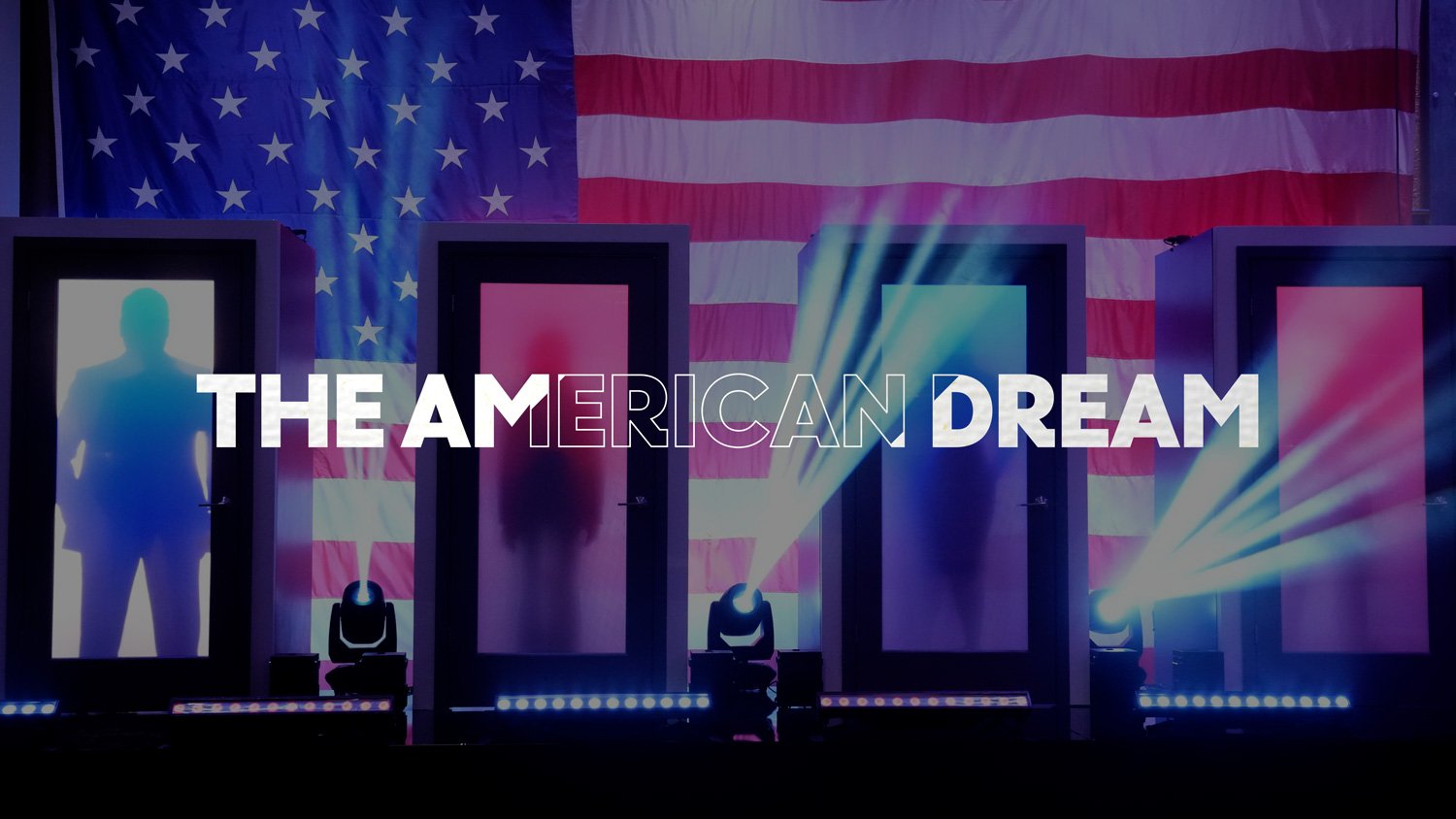
Hell’s Kitchen - Season 22
As Fox prepared the 22nd season of Hell’s Kitchen, they wanted to cook up a fresh look for the hit Gordon Ramsay cooking competition.
When our team was presented with the opportunity to create a brand new visual identity and full toolkit for the show, we couldn’t help but say a resounding, “Yes, Chef!”
In our Hell’s Kitchen case study, you’ll…
Learn about the challenges of updating a brand with such an established legacy,
See behind-the-scenes techniques our artists used to create sizzling visuals,
And read many more cooking puns.
Let’s dig in.
If you can’t handle the heat…
Airing for 22 seasons is an incredible accomplishment. So working on Hell’s Kitchen presented an exciting, yet daunting opportunity.
On one hand, it’s a thrill to be able to be part of something with such longevity. You know your work is going to reach an established audience who loves the show.
On the other hand, that legacy brings pressure. You have to make sure you create something that feels familiar to the audience, yet brings a fresh perspective. It has to be new, while still fitting into the Hell’s Kitchen and Gordon Ramsay brands.
This project also had a tight turnaround, with less than a month for production. The heat was on.
Our artists dove into taking the Hell’s Kitchen recipe that had worked for so long, while adding some new ingredients and an updated presentation.
Red, White, and Bleu
“I’ve developed a deep appreciation for America and what this great country stands for. The opportunities it offers. And more than anything, I love extending those opportunities to hungry and passionate chefs. I know for many of you, Hell’s Kitchen represents the American Dream.”
- Chef Gordon Ramsay
This season’s tagline is The American Dream. The show needed visuals to match its powerful theme, but Fox wanted a unique take. Stars and stripes were off the menu.
So our first job was to come up with a Hell’s Kitchen twist on Americana.
Igniting our imagination
Fortunately, we were able to hit the ground running. Fox came to us with several mood boards and ideas, broken up into several different directions:
Bold, Unapologetic Type
Flag Motion
Pattern O’Hades
Color vs. Color
Road Trip (to Hell)
Burn It
The first step in our creative process was to flesh out these directions by creating styleframes.
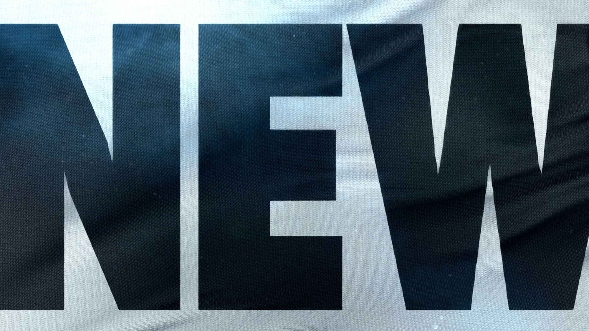
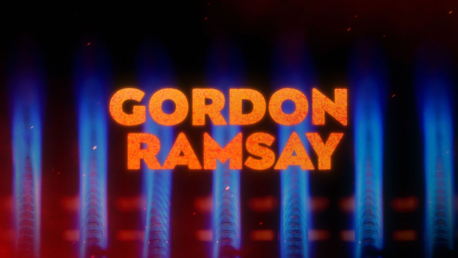
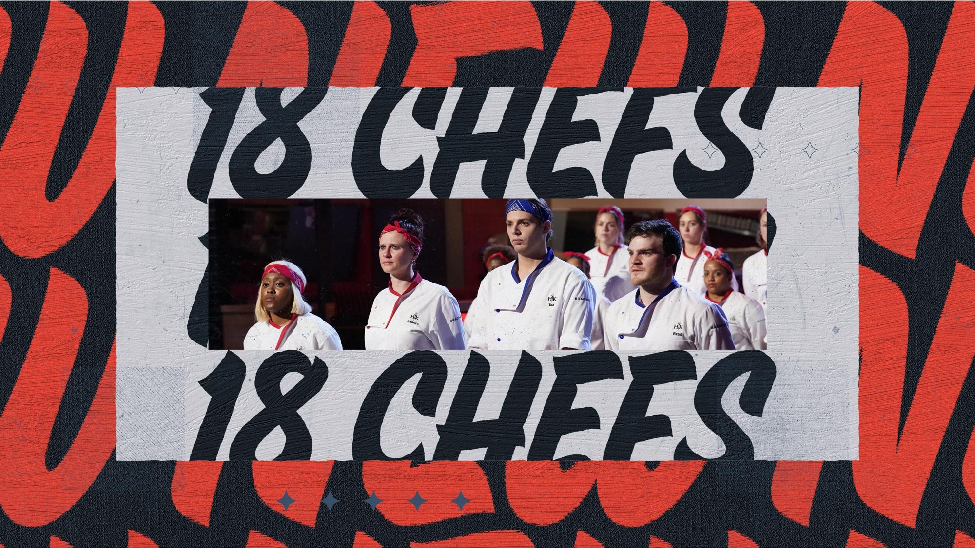
We then pitched these back to the team at Fox, who opted for the Flag Motion option.
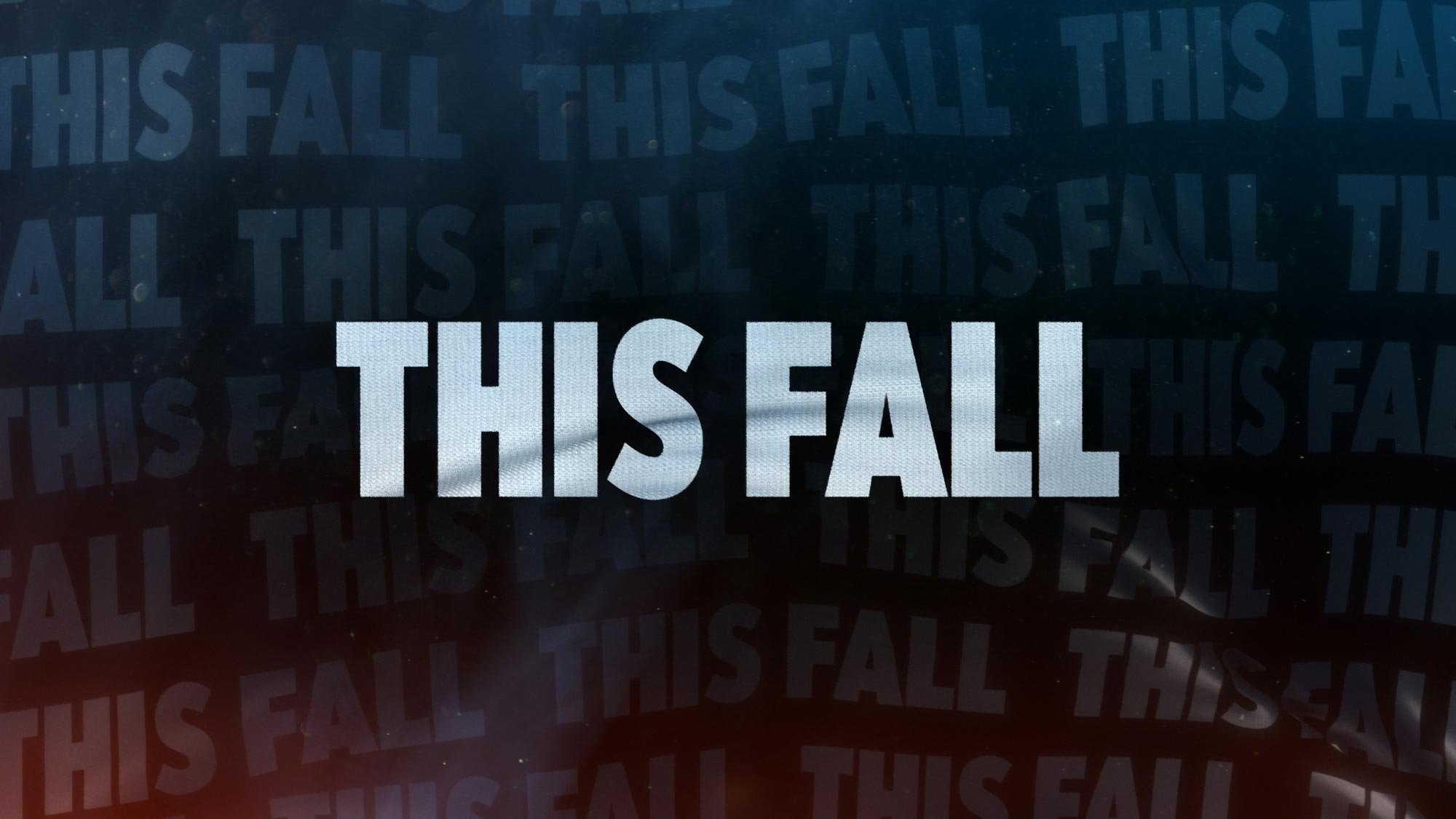

Elements from the other directions got folded into this main direction, such as the burners from the Heat concept.
In parallel with the styleframes, we worked on logo development. After several rounds, we were ready to get cooking.
Out of the frying pan and into the fire
Production lasted roughly 3-4 weeks. Building this toolkit was a little like cooking Gordon’s signature Beef Wellington. It’s complex and requires many different steps and techniques to be executed flawlessly.
One of the biggest challenges we encountered was simulating realistic cloth and flag motion. This was the centerpiece of Fox’s chosen direction, so we had to perfectly dial in the right materials and textures.
Being part of a toolkit, flexibility is also at a premium. We wanted Fox to be able to have the ability to update the textured text on the flag in After Effects without having to re-render the entire shot in 3D, which would be cost and time-prohibitive.
We accomplished this by using UV passes from the 3D flag renders.
Speaking of flexibility, we created options for multiple text lines and different colors for the vast number of deliverables across broadcast and social platforms. That meant everything needed to look good in 16x9, 1x1, and 9x16.
Dinner is served
The end product is a visual identity and toolkit that sizzles.
Our thanks to the team at Fox for helping us cook this up!
Credits
Client: Fox
VP of Broadcast Design: Jesse Hellas
Executive Director of Operations, Broadcast Design: Jeff Hazan
Senior Director, Design: Dan Pierse
Production Company: Elevation
Executive Creative Director: Stephen Cocks
Art Director: Dianne Frisbee
Creative Director: David Hendrix
Senior Designer, Animator: Sean Kiley


