MRI Interactive Conference App
Our friends at MRI wanted to create a more engaging experience for their conference goers. Their vision was to create a custom interactive app, presented on a giant touchscreen device in their booth.
In the app, conference attendees would explore the colorful city of Sunshine Falls, and discover more about the features of MRI Living and MRI@Work through video demonstrations. Since the app would be using the same 2D art style that we’ve worked with for many years of the MRI Ascend Conference and product videos, they turned to us to see if we could help make their vision a reality.
We are technically-savvy nerds, but we aren’t coders. There was also a very tight turnaround of just 6 weeks for asset creation, app development, and testing.
We knew that there had to be a solution to the problem.
No Code, No Problem
As we explored different options, this app fell in a challenging in-between zone. On one hand, MRI needed a fully interactive multimedia experience that could be used without an internet connection, since improving the Wi-Fi of conference centers around the country is a bit out of our control. This eliminated options like Power Point or a HTML-based web app.
However, the app did have a relatively limited scope. It didn’t need to do complicated database calls or render 3D levels in real time. Going the route of fully custom app development from scratch would have been overkill, as well as cost prohibitive and unrealistic on the short timeline.
However, there was a Goldilocks solution that was just right for the scope and deadline: using a no-code app development platform.
No-code platforms let you create an Android or iPhone app using user-friendly drag and drop tools. While a level of technical proficiency is required, going with a no-code platform drastically speeds up the development process.
After researching many of these platforms, we landed on Thunkable. It supported offline apps and video, which were both requirements. Thunkable also features a very intuitive user interface that is simple while supporting a surprising amount of complexity.
Our writer James created a quick proof-of-concept app using clips from previous MRI conference videos we had made. Within a day, we had a working prototype that looked good enough to give the team at MRI an idea what it would look like on their device.

Get in the flow
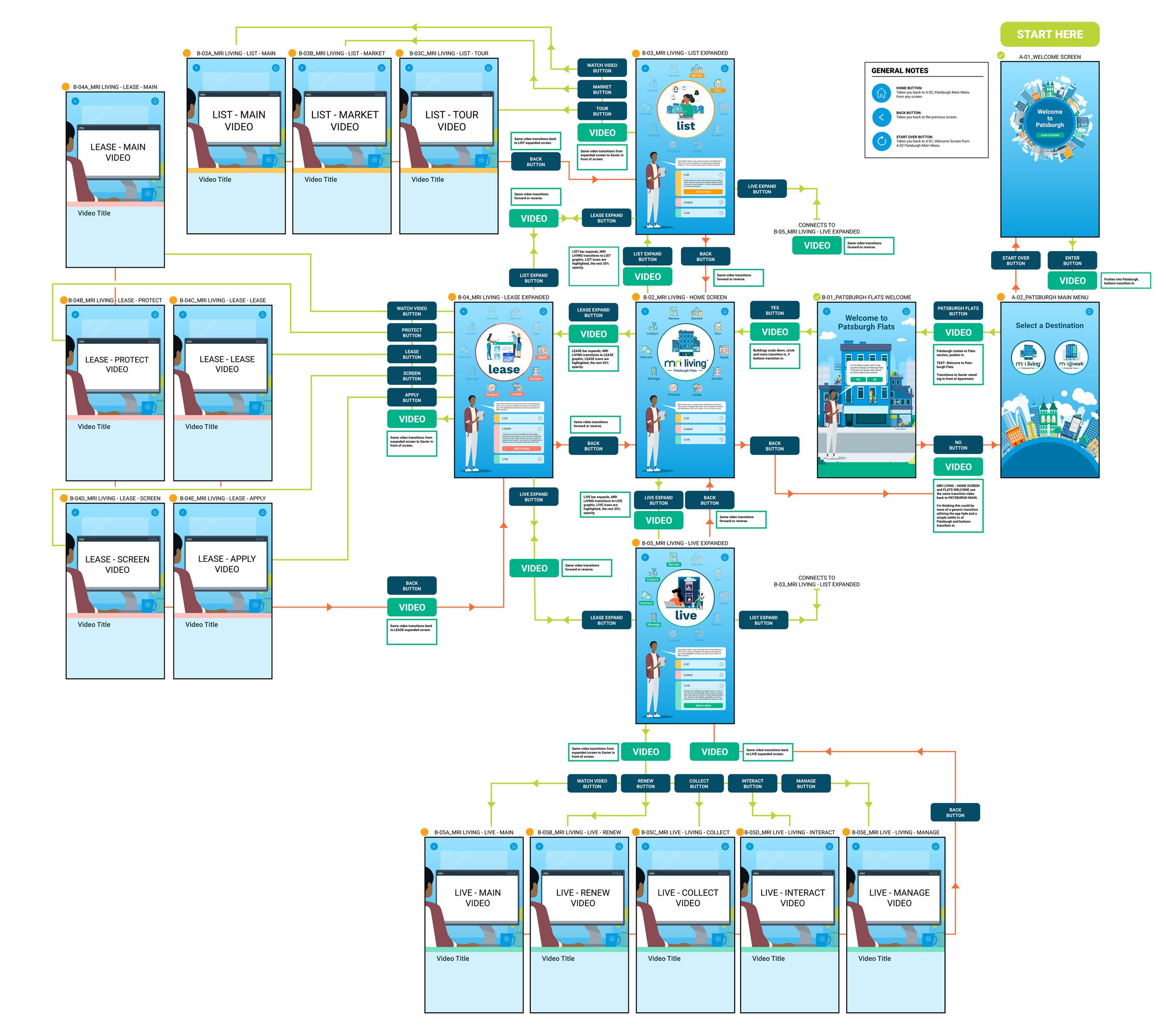
MRI first developed the content of the app as a Power Point presentation, with every screen in the app as a slide. This was helpful for us to figure out the scope of the app, but we still needed to figure out the path users could go down in the app.
We converted the slideshow into a decision tree, laying out the flow between screens that the attendees could go through. This gave both our artists and our writer-turned-programmer James a way to simultaneously get started on the app.


Creating digital curb appeal
The first big step in development was translating MRI’s Power Point slides into app content.
Since the touchscreen device would be presented in portrait mode, we converted all of their 16x9 slides into polished 9x16 vertical designs. Once approved, these screens were then brought into the app development environment, with interactive touch points overlaid on top of the image to make sure that the layouts were identical to the mockups.
Thunkable had a standard sliding transition between screens. To give the app more of a dynamic presentation and sell the idea that you are traveling through MRI’s 2D city, we created bespoke animated transitions that moved the user between the major branches.
This required some custom logic, as well as fine tuning to make sure that everything lined up correctly.
One major feature of the app would be the ability to play almost 20 different product videos, depending on the path the user went down. There was one issue: the app had a 50 MB limit. This required some serious problem solving. Thankfully, that’s something we excel at.
With the help of the team at Thunkable, we came up with a clever solution. The app had the ability to use videos stored within the tablet’s file system. We created a password protected section of the app, where the MRI team could load the locally stored videos into the app using the Android file picker.
This worked like a dream, and it had the added benefit of allowing MRI to update and change videos without needing any extra work on our end.
Problem solved. Or so we thought.
Debugging
One of the main constraints and challenges of this project was the giant touchscreen device, which was effectively a 42” Android tablet with a 1920x1080 resolution. The device was plenty capable to drive our Thunkable app, but it did present two issues.
Issue One: The screen resolution and aspect ratio is very unique for Android tablets.
Issue Two: We didn’t have access to the device to test for ourselves. We found a test device with close specs, but not exact.
This created some small layout issues that were easily fixed by working with the MRI team to test the app on the device and make adjustments from there. However, we ran into one very large issue just days before the event.
Remember that clever solution with the file picker to play locally stored videos? That worked on our test tablet and several of our other personal devices. However, something within the operating system on the 42” tablet prevented the file picker from ever launching.
After several calls and chats with the teams at the hardware and software companies, we had to come up with a solution that was even clever-er.
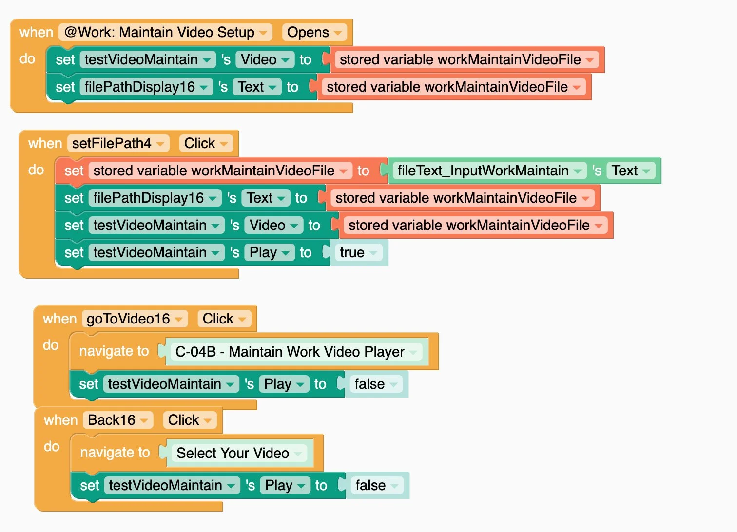
Instead of relying on a file picker, we created a workflow that let the MRI team input the file path of the video and store this as a variable in the app. As long as the app had the proper permissions to the files system, this worked just as well as the file picker solution - it just required a few extra steps.
In order to make sure that the app would be set up properly, our team also created written and video documentation that provided step-by-step instructions on the video setup process.
It takes a neighborhood
Once the last bugs were squashed, the app was published and loaded onto MRI’s device in time for the MRI Ascend Conference.
As always, it was great working with the team at MRI to create a fantastic interactive showcase for their conference guests.
We also must thank the incredible team at Thunkable, not only for their intuitive platform, but for their great and responsive support team. Shoutout to Matt, who answered our many very specific questions and actually would create test apps to show how to create specific interactions within the app. Creating this app in such a short turnaround wouldn’t have been possible without their tools or their guidance.
Credits
Client: MRI
Chief Marketing Officer: Mandira Mehra
Senior Director, Brand and Communications: Cederick Johnson
Project Manager: Erin Harrah
Production Company: Elevation
Executive Creative Director: Stephen Cocks
Art Director: Dianne Frisbee
Producer: Alina Klopach
Designer / Animator: Daniel Cooper
App Development / Writing / Research: James Grosch


